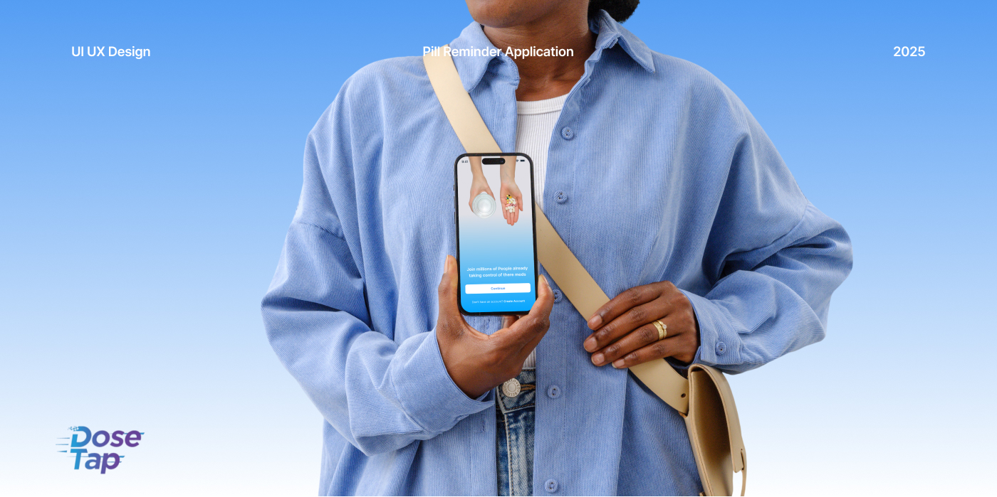
Primary Purpose: Develop a user-centric UI/UX platform designed to help users manage their medication schedules effectively. The app enables users to set reminders for their prescriptions, ensuring they never miss a dose.
Target Audience: Patients, Caregivers, and Healthcare Providers
Technology Used: Figma
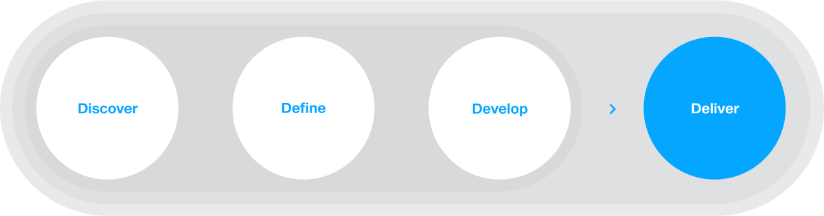
PROJECT OVERFLOW
The DosTap app redesign project will start with comprehensive research, including user interviews and competitive analysis, to identify existing problems. This research will guide the design phase, where wireframes and prototypes will be developed and refined through usability testing. Once a user-friendly design is finalized, it will be handed over to developers for implementation, followed by thorough quality assurance testing. After the app’s launch, user feedback and performance data will be continuously monitored to optimize the app and ensure its long-term success.
THE CHALLENGE
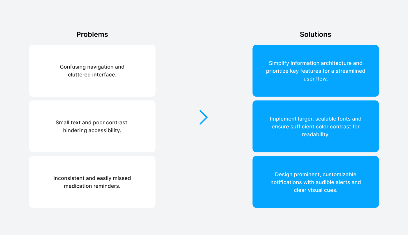
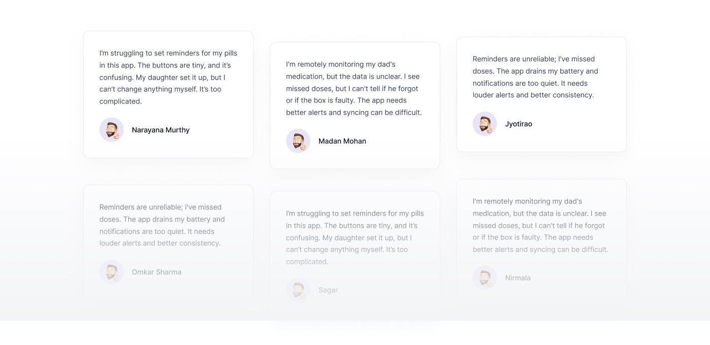
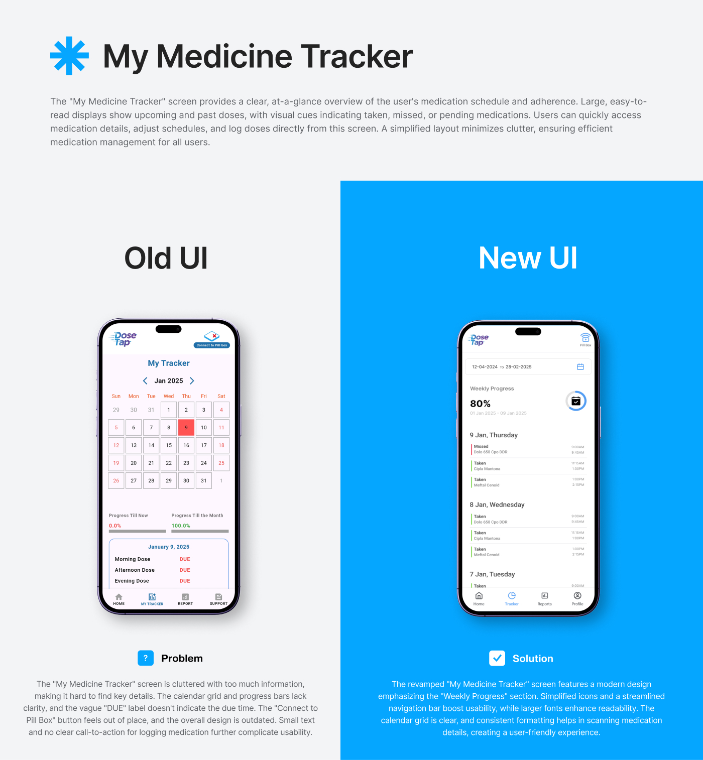
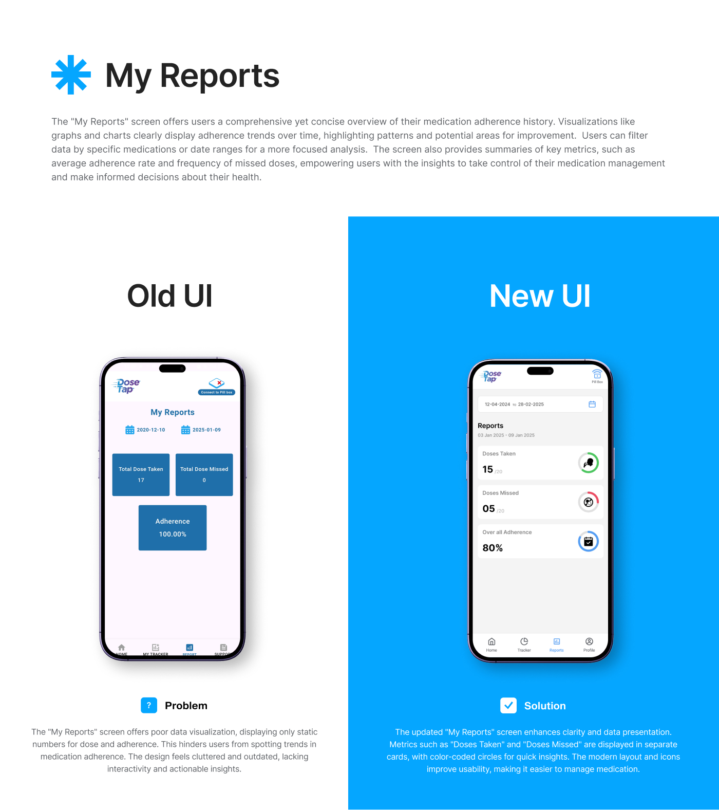
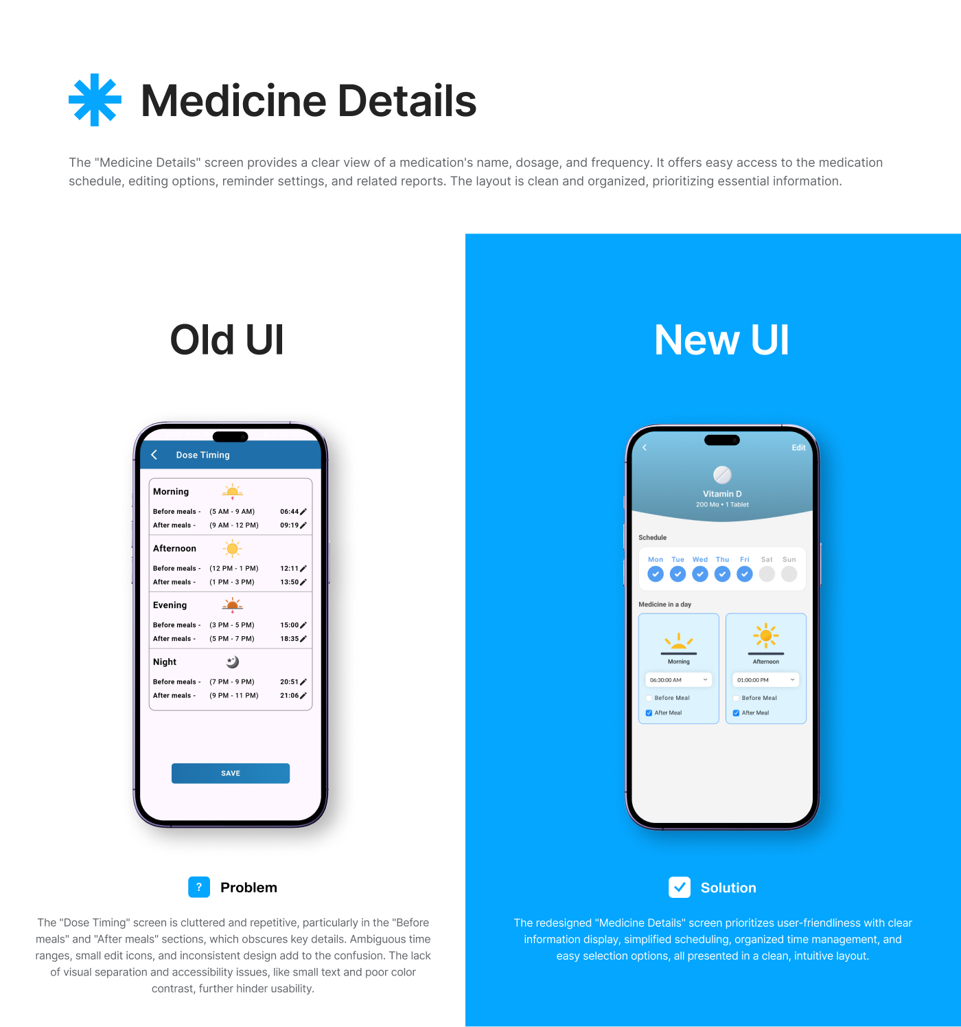
The DosTap application faces several critical issues that impact user experience and medication management. Its cluttered and unintuitive interface makes navigation difficult, particularly for elderly users. Small text and unclear icons further contribute to accessibility concerns. The medication reminder system may be too subtle, increasing the risk of missed doses, while caregivers may struggle with remote monitoring due to limited data visibility or overly complex displays.
The core challenge in redesigning the app lies in simplifying this complex medication management system for diverse users. Ensuring accessibility, reliability, and clear, actionable information is crucial to improving user engagement, reducing frustration, and enhancing medication adherence.
THE SOLUTION
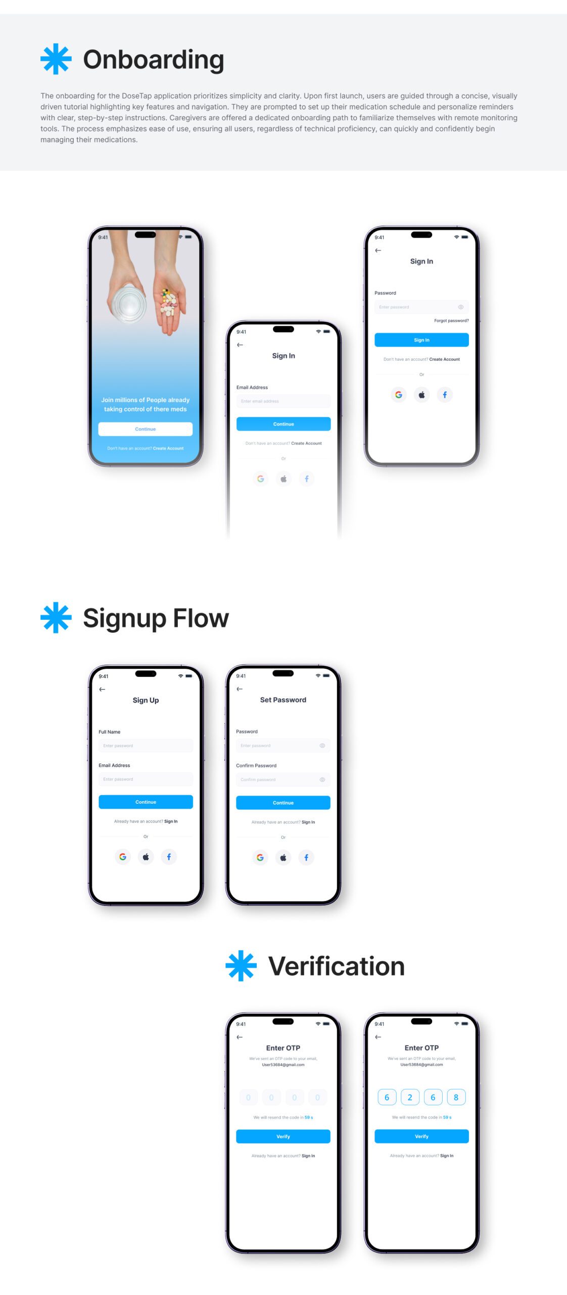
The redesigned DosTap app will prioritize a simplified and user-friendly experience. The interface will feature a clear, intuitive navigation structure that highlights essential features for easy access. A clean, uncluttered layout will ensure users can quickly find what they need. Accessibility improvements will include larger, scalable fonts, high-contrast color palettes, and clear, universally recognized icons to support elderly users and those with visual impairments.
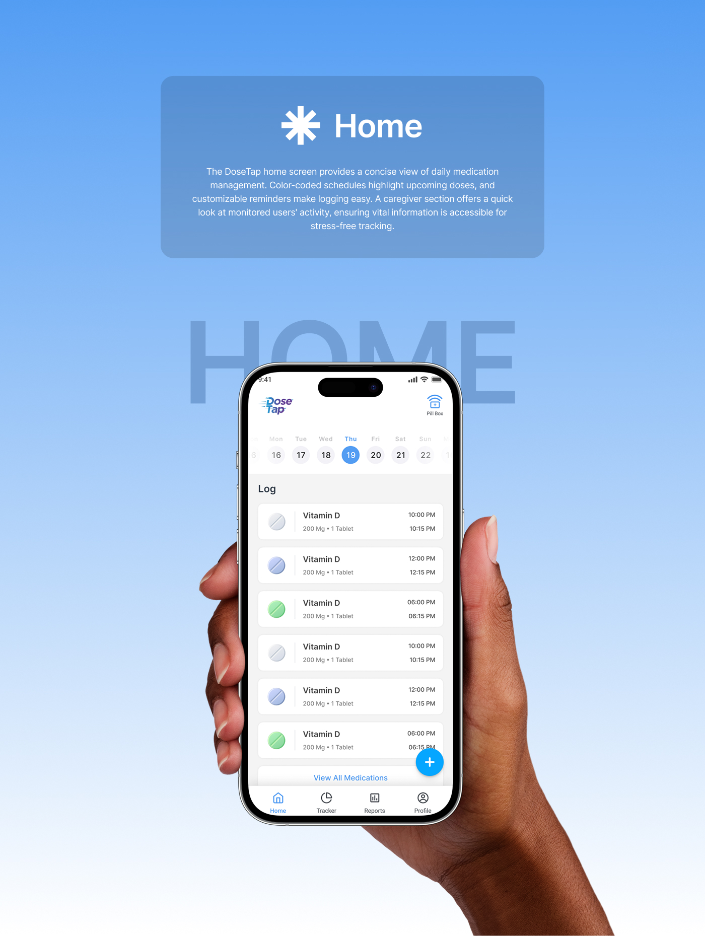
The medication reminder system will be enhanced with prominent, customizable notifications, audible alerts, and clear visual cues to minimize the risk of missed doses. Additionally, caregiver remote monitoring will be improved by offering comprehensive yet easily digestible data visualizations, ensuring critical health information is accessible at a glance.
This redesign aims to deliver a personalized, streamlined experience that promotes medication adherence, reduces frustration, and empowers both patients and caregivers.
STYLE GUIDE
The DoseTap app adopts a calming blue color palette, designed to evoke trust, reliability, and a sense of calm — crucial elements for a medication management platform. Blue’s inherent stability helps reduce user anxiety, while its clarity directs focus to essential information. The chosen shades ensure strong contrast for improved accessibility, enhancing readability for all users, including the elderly or visually impaired. By combining professional aesthetics with user comfort, this color scheme aims to create a reassuring and user-friendly experience that encourages medication adherence.
Aa
POPPINS(HEADING)
Aa
ROBOTO(BODY)
Blue#05A6FF
Black#324054
Gray#7C7C7C
Light Gray#E2E2E2
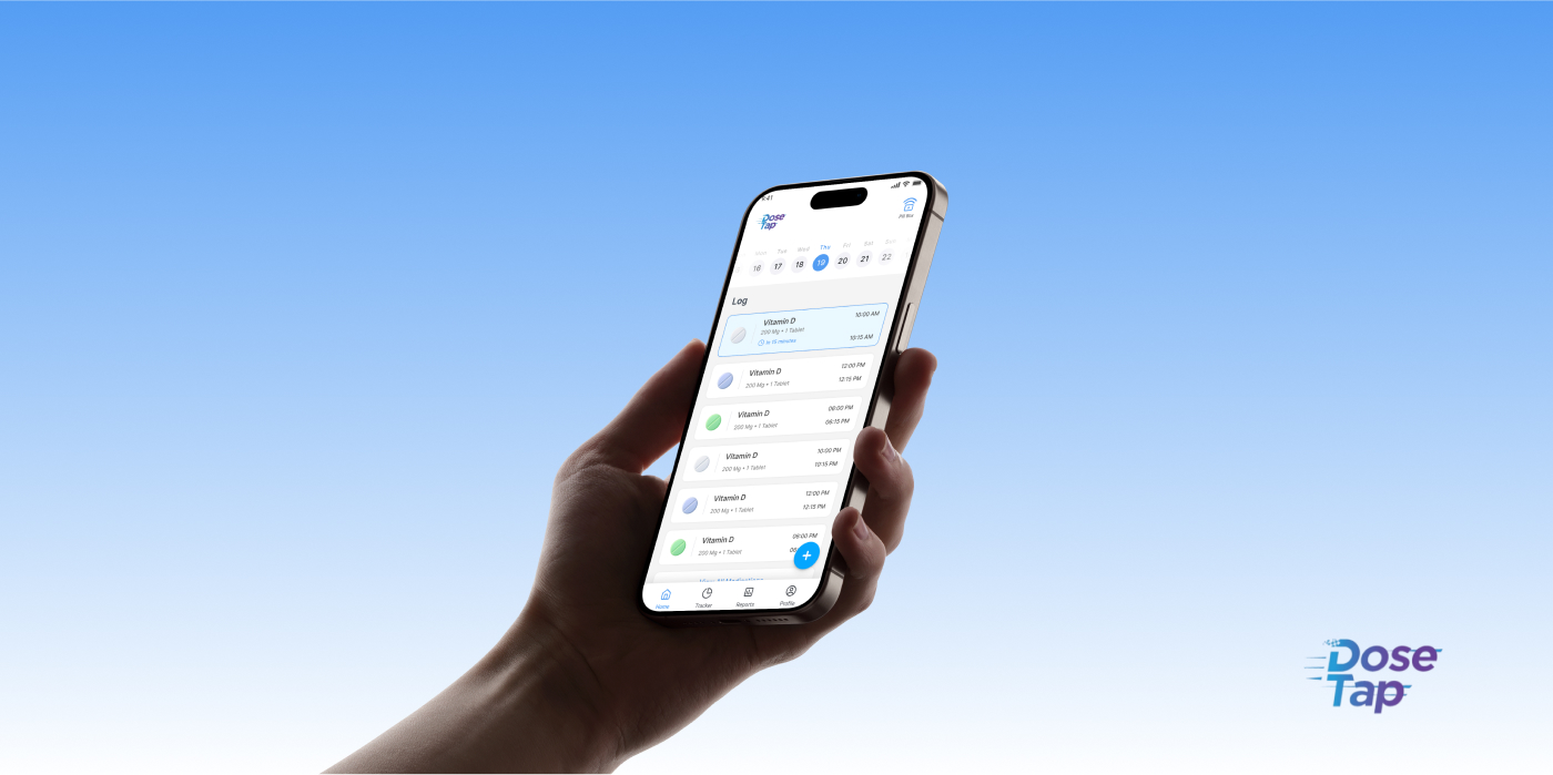
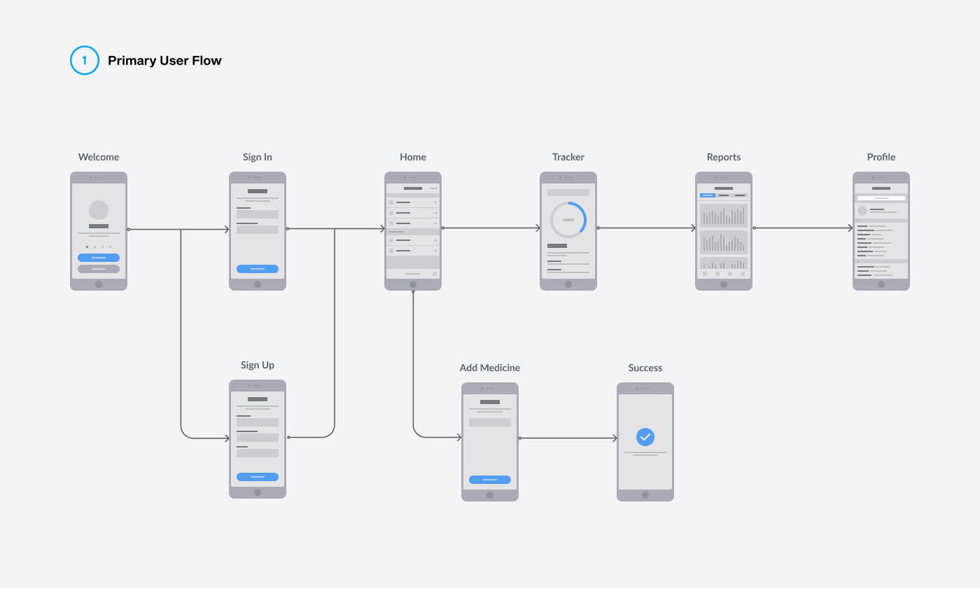
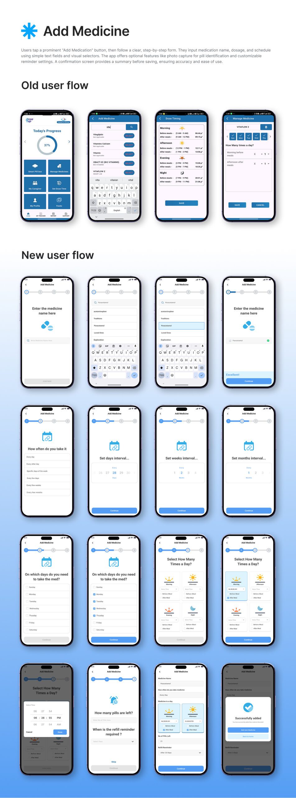
User Flow
The DoseTap app is designed to provide a seamless and intuitive experience for users managing their medications. Upon opening the app, users are welcomed by a clear dashboard that displays their medication schedules and adherence status at a glance. Setting reminders is simple, with customizable notifications and audible alerts to ensure no dose is missed. Adding or managing medications is streamlined through intuitive forms and visual cues, making the process straightforward. For caregivers, a dedicated section offers clear and concise data on medication intake, enabling effective remote monitoring. With its intuitive navigation, the app ensures all users, especially elderly individuals, can effortlessly manage their medications and access important information with ease.
THE RESULT
The redesigned DoseTap app significantly improved user experience and medication adherence. Users, particularly elderly individuals, reported easier navigation and greater confidence in managing their medication schedules. Enhanced accessibility features, such as larger fonts and high-contrast visuals, improved usability for visually impaired users. Caregivers benefited from streamlined remote monitoring, enabling quicker assessment of medication intake. The revamped reminder system, featuring prominent and customizable alerts, effectively reduced missed doses. As a result, user satisfaction increased, reflected in improved app store ratings and positive feedback, highlighting the redesign’s success in enhancing medication management.
THE CONCLUSION
The comprehensive redesign of the DosTap application effectively addresses its initial challenges by prioritizing clarity, accessibility, and user-friendliness. With simplified navigation, improved visual hierarchy, and a clean, modern aesthetic, the app now offers a more intuitive and efficient medication management experience. Key screens such as “My Tracker,”“My Reports,” and “Medicine Details” have been revamped to present information clearly, enhance readability, and improve functionality. This thoughtful redesign empowers users — including elderly individuals and caregivers — to confidently manage medications, ultimately promoting better adherence and improving overall user satisfaction.
By submitting this form, you consent to receiving email communications from FTSE Russell and the London Stock Exchange Group of companies (together, “LSEG”).